


Possible End-Game for this Multi-Year Cycle in BTC and Alts
Range Bound and then Off to the Races

Dear Reader,
Technically, in the shorter term, price is looking toppy here as it continues to oscillate in an extended range around 100K. For investors who bought at lower levels this should be no cause of alarm at all, for this would be just continued normal volatility within a technical range. Indeed, a technical chart looking at possible levels of consolidate should serve to assuage any alarm that might set in on a decline.
For those yet to buy, coming to the market recently and hoping for a more opportune entry, the technical chart is going to be of much interest, where on the one hand they are looking to avoid buying a peak price, and on the other are looking to establish a position.
So first to a chart in that medium-term time-frame that provides enough price action and context to enable some technical analysis, which can at least provide some rationale to buying and selling beyond the momentary sentiment of the market.
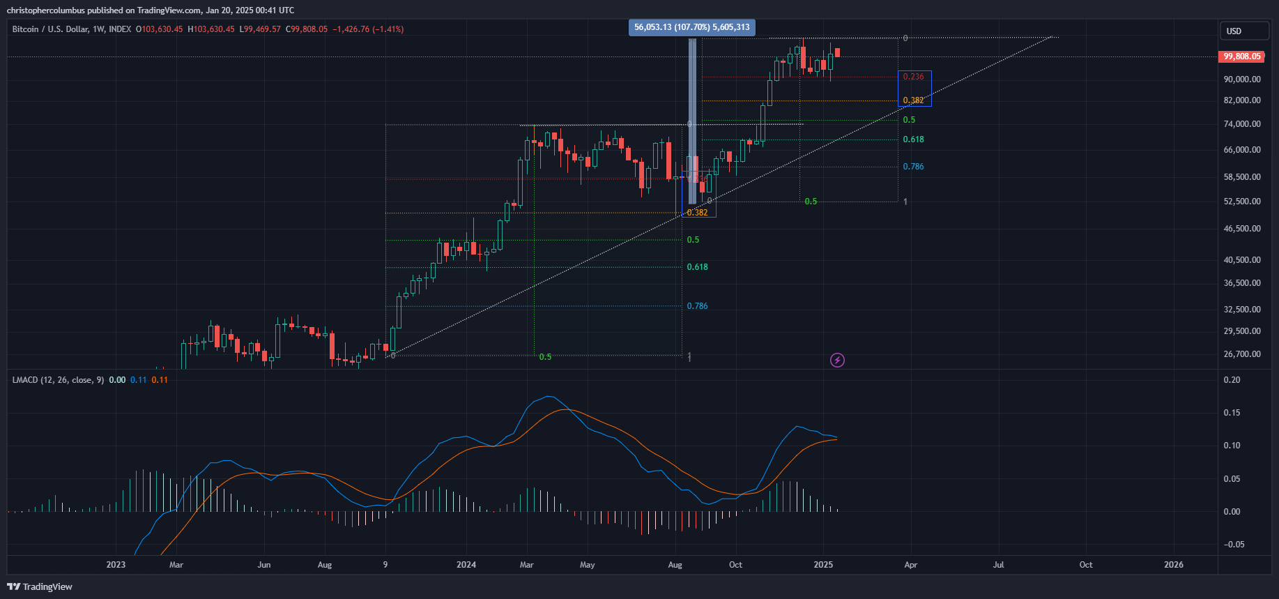
The first noticeable metric is the rapid 2x move over a few months, and where that move has currently stalled. Price has since then been contained in that top range of the fib for a couple of months now with momentum to the upside starting to look lost with the weekly MACD on the cusp of crossing.
Though price can always explode to the upside at any time, technically, there is a good chance of a further move to the 0.38 fib level. Accordingly, the trader/ investor could treat this as a stress-test of sorts - if such a move developed, would I be OK with it?
Does this mean the top could be in? Not at all. Rather, it looks to be yet another technical correction of a technical move up. Further, there is nothing too extreme in this price prediction, and certainly nothing to flip one from ‘bull’ to ‘bear’. I’d consider it more technical consolidation as opposed to a severe correction.
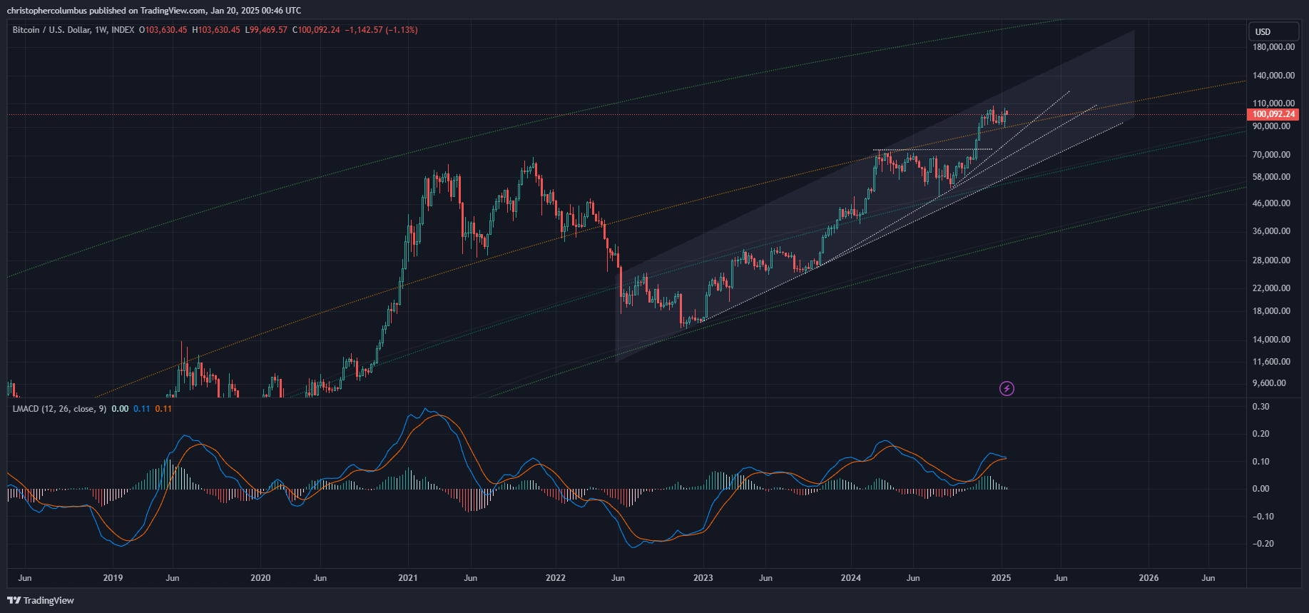
This reading, or perspective on possible price development, becomes weightier on further zooming out a little more on the chart, where that greater multi-year trend up becomes apparent.
For access to full article and archive to previous articles, make sure to subscribe now.